

This past week has been a wild ride for Ottawa Senators fans. On Monday morning, The Athletic reported details of the long-awaited rebrand they say is set to debut next season. By Friday night, an apparent leak via the NHL’s own online store seemed to confirm the details.
Monday: The Report
In a story published July 13 by The Athletic, Hailey Salvian quoted a source as saying: “It’s a well-known fact within the organization that a rebrand is taking place prior to the 2020-21 season.”
Salvian said the outlet had seen “a picture of the jersey mockup” which “showed a two-dimensional logo that is nearly identical to the one used between 1997 and 2007.” She went on to paint a detailed picture of the new home and road sweaters, as follows:
The home jersey mockup is black with two red bands on the arms, encasing the numbers, and a single red stripe around the bottom. The away jersey is white with red bands on the arms and black forearms. It has a red stripe atop a black stripe running around its bottom edge.
Frequent Icethetics concept art contributor Orion Taylor ran with that description, creating and sharing this interpretation.

In his mockup, Taylor took some liberties with the crest by employing a logo that merges elements from the Senators’ original 2D logo and the updated design that launched in 2007 (but saw only minimal usage). Here’s a closer look at the original marks being referenced.

The newer mark is unquestionably a superior design for a number of reasons that don’t start with nostalgia, but we’ll save that discussion for another time. The point here is that while the Senators began shifting toward 3D centurion logos in the late 1990s, they’ve always had great 2D options in their brand arsenal.
Friday: The Leak
That brings us to Friday night, when new images of a hoodie appeared on NHLShop.ca, the Canadian version of the NHL’s official online store. Multiple Twitter accounts memorialized the find—which Icethetics has also captured below—before it was removed from the website.

As of last check this morning, the page is live again, but the item is labeled as “discontinued” and “currently unavailable.”
The Fanatics branded hoodie clearly displays a logo almost identical to what the Senators debuted in 1997. The key difference is minimal and easy to miss if you’re not looking for it. This graphic below should help illustrate it.

Setting aside the shade of gold—which is more a function of how Pantone metallic colors display on digital screens—the areas lined in red are now gold. The only part of the logo that’s still red is the crest of the galea.
Color Commentary
Now let’s talk about the gold color for a moment. If you’ve read my previous article about the Buffalo Sabres, you’ll recall the geeky attention to detail regarding the Pantone standardized color system employed across the NHL. I have some more of that today.
Did you know the Senators have more than one official gold?
Senators gold is meant to be shiny and sparkly, especially on a sweater. But a lot of color applications, especially on digital platforms like the one you’re using right now, can’t accurately reproduce that metallic luster. So the team has two official versions:
- Pantone 1245—which is a flat yellow-gold that looks great on computer and smartphone screens, and
- Pantone 872—which is a shiny metallic gold that when translated digitally appears duller and more muted.
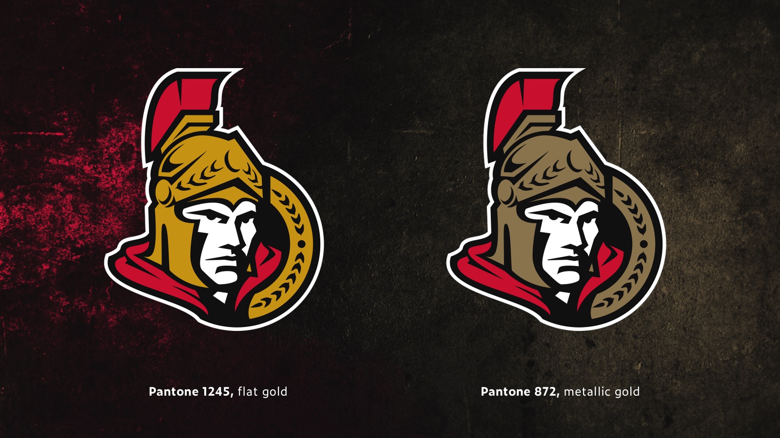
In recent years, the team has almost always used 1245 as its preferred gold in digital graphic applications. But that seemed to change when the NHL paused in March. In the team’s statement of league support, the current primary logo appeared, using 872, the metallic gold. (I’m not suggesting the Sens have never used this gold before, but 1245 has certainly been more common.)
As of today, that 872 gold is in use all over the Senators’ website and social graphics. It’s used mostly over a black base with almost no red accents, a color that previously dominated their creative. So it definitely seems like a change is in the works.
While it sounds like the Sens’ new primary sweater will be black, don’t expect red to disappear completely. In her story, Salvian did say a third jersey will be part of the new branding.
“While a red colour scheme would be the logical choice, the source cautioned that final decisions on the third jersey have not yet been made,” she wrote. For the past couple of seasons, Ottawa has used a red alternate with a silver “O” which was introduced in 2017 for the NHL100 Classic, one of the outdoor games the league put together for its 100th anniversary.
If final decisions truly haven’t been made yet, it makes me wonder about the timeline of the release of a new third jersey. Adidas typically needs 18 months to go from final design to putting something on the ice and in retail stores.
Is the Leak Legit?
Color talk aside, you might be wondering about the legitimacy of Friday’s leak. You could say that team merchandise makes use of throwback logos all the time. What makes us so sure this is not that? Apart from the color change mentioned earlier and The Athletic report, this line of hoodie designs doesn’t seem to feature throwback logos.
Here are just a few examples.

Next question: How do we know this image actually came from NHLShop.ca? And how do we know it’s not Photoshopped?
I mention this in case the page disappears again by the time you’re reading this article. Not only did I see the page for myself and capture a screenshot, it’s been memorialized elsewhere as well. Some Twitter users, including @CompleteHkyNews, also tweeted a direct link to the hoodie in question, before the page was removed.

When you tweet a link, Twitter captures some preview information and an often an image from the source website so your followers have something more to see beyond a truncated URL. So even though the page was later removed, we know the image was, in fact, collected from nhlshop.ca. We can trust this image more than a screenshot because it isn’t susceptible to editing by the person posting.
On top of all that, the fact that the page was suddenly removed from the site after being discovered suggests it’s something we weren’t supposed to see yet. That being said, the page is back up, but it’s hard to say whether that’s a mistake.
So at this point, it could be safe to say the Ottawa Senators have given up on the search for a new logo, and aresimply returning to something that seemed to work for them 20 years ago. I only wish they’d taken the time to give the design a few modern updates. Honestly, the logo Orion Taylor used in his concept would be ideal. But that’s just my take.
How Did We Get Here?
With articles like this I always like to provide a little background for extra context. In my previous JerseyWatch update for the Senators in March, I mentioned this long-awaited rebrand could be up in the air given all the management upheaval within the organization.
The first public mention of an Ottawa rebrand came in September 2018 when COO Nicolas Ruszkowski told TSN the team would have a new permanent logo for 2019-20. By May 2019, he was no longer with the organization and no new logo materialized.
Meanwhile in December 2018, CMO Aimee Deziel told Sens Callups podcast a new logo was in the works to launch in 2020-21 at the earliest. She left her post in August 2019. Most recently, CEO Jim Little referenced a rebrand in an interview with TSN 1200 in Ottawa. He was gone in March after only seven weeks on the job.
There seemed to be a curse hanging over this rebrand. Anyone who spoke of it publicly disappeared soon after. I kid, of course, but the real reason probably has more to do with a poor corporate culture—something that seems to have trickled down into the fan experience as game attendance in Canada’s capital ranked last in the NHL this season.
So given all of that, I had my doubts that this rebrand would actually happen on schedule. After all, who would be left to shepherd it? But it does seem like the Senators were able to progress on the promised changes.
To be honest, it also makes me wonder whether a new design was actually in the works at some point, but given all the leadership uncertainty, somebody threw up their hands and said, let’s just go back to the old logo and call it a day. (Complete speculation on my part there, but it wouldn’t surprise me.)
When Will It Be Official?
If the leaks are real, the last question that needs to be addressed is when this all becomes official. Assuming all goes to plan, the 2020 Stanley Cup Playoffs will end no later than October 4. And last I read, the NHL is targeting a December start date for the 2020-21 season with a full 82-game schedule.
So if the Senators don’t want their announcement to get drowned out by playoff coverage, I would imagine an official “unveiling” could come between October and December. That is, unless they can get it done before the Qualifiers start on August 1. Something to keep an eye on, for sure.
And I think that pretty much exhausts the subject at this point. I’m curious to see what everyone’s thinking of all this. Do you like the idea of the Senators returning to an older logo, or do you think they should’ve gone in a different direction?
